

Otto Name Ring — Cut-Out Letters in 14k Yellow Gold
$$
14k yellow gold
A father commissioned this ring to carry his newborn son's name after the couple's path to having him involved seven embryos. Early on they considered a line of seven stones across the top to mark that number, but ultimately chose to keep the band open and stone-free. When it arrived, he wrote simply: "it's beautiful."
'I freaking love it! Let's do it!' — on design approval
'Yes ma'am, it's beautiful' — on delivery
Quick specs
Design type
Primary Metal
Primary Stone
Accent Stones
Design Complexity
Intent: Certainty
Size
Ring size 8 US. Band width 5-6mm.
How they made it distinctive
-
01
Cut-out letterform design chosen so the name reads as open negative space rather than raised or engraved text
-
02
The two T's engineered to share structural lines with the band, creating a seamless illusion rather than four separate applied letters
-
03
O's reshaped from rounder circles to an oval form after an early sketch felt too dropped-in rather than integrated
-
04
Design was tested both with and without a line of seven accent stones — one for each embryo in the family's path to their son — before the stone-free version was chosen
-
05
5-6mm band width specifically chosen to keep the cut-out letters legible and proportioned
How you'd make it yours
Stone option: this piece is stone-free; a new commission could add a line of accent stones across the top of the letters
Metal: this piece is 14k yellow gold; the same cut-out technique works in white or rose gold
Name length: this piece spells a four-letter name; a new commission can spell any name or set of initials
Band width: this piece is 5-6mm; a new piece can be made narrower or wider depending on the name length
One of a kind: this exact ring was designed for one client's son and is not reproduced — a new commission is an original piece inspired by this one, not a copy
Design changes made
The O's were reshaped from rounder circles into a more oval form after the client felt they looked 'dropped in' rather than seamless. The design also went through a stones-vs-no-stones comparison — including a version with seven stones representing the number of embryos in the family's journey — before the client asked to remove all gemstones and keep the band clean.
Who this is for
This piece is for someone who wants a name or word carried on their hand in a way that feels architectural rather than simply engraved. It's especially right for a parent who wants to wear their child's name every day, in a design that reads as considered and integrated rather than an afterthought stamped onto a plain band.
How it's made
Once the cut-out design was finalized in yellow gold, a 3D-printed resin model was produced first — the physical preview of the letterforms and negative-space cuts before any metal was involved. That resin was then invested in plaster and fired in a kiln to burn out the wax/resin pattern, leaving a hollow mold. Molten 14k yellow gold was cast into the mold under pressure to form the raw ring.
After casting, the ring was cleaned and the cut-out openings were refined by hand to sharpen the letterforms, since casting alone can leave rough edges inside tight negative-space cuts like the T transitions and oval O's. The entire band was then polished to a uniform mirror finish — there are no mixed finish zones on this piece, since the final design carries no gemstones and no textured surfaces to set apart.
Key note
The T's were engineered to share structural lines with the band itself rather than sitting as separate applied letters, which is why the cut-out reads as one continuous illusion rather than four distinct letterforms.
Pricing guidance
A cut-out name ring in 14k yellow gold with moderate letterform detailing sits in the mid range for custom bands. Most of the cost comes from the hand-finishing needed to keep the negative-space cuts crisp and the letters legible at a 5-6mm width, rather than from the metal itself. Removing or adding stones is the biggest single lever on price from there.
Moves price up ↑
- ↑ Adding gemstones back into the design, such as a line of accent stones across the top of the letters
- ↑ Upgrading from 14k to 18k gold, which increases material cost
- ↑ Widening the band beyond 6mm, which requires more metal and more hand-finishing to keep letterforms clean
- ↑ Adding a two-tone metal treatment to make individual letters stand out from the band
- ↑ Increasing the letter count for a longer name, which adds more cut-out detail work
Moves price down ↓
- ↓ Keeping the design stone-free, as this piece ultimately is
- ↓ Choosing 10k gold instead of 14k
- ↓ Narrowing the band width, which reduces both metal use and finishing time
- ↓ Simplifying the letterforms to a plainer block font with fewer illusion-style transitions
- ↓ Choosing a shorter name or initials instead of a full four-letter name
Questions people ask
Yes, this is done by cutting the letterforms directly through a solid metal band so the name reads as open negative space rather than raised text. The design has to account for how each letter connects to the band structure so the ring stays strong enough for daily wear. Letters like O and T often need small adjustments during design to look intentional rather than simply punched through the metal. The whole name typically runs across the top portion of the band, with the lower portion left solid.
All three work structurally the same way, since the cut-out technique doesn't depend on metal color. Yellow gold tends to make the negative-space letters read more clearly against skin tone in everyday lighting, while white gold and rose gold shift the overall look cooler or warmer respectively. The choice usually comes down to personal preference and what the wearer already wears daily. Fourteen karat gold is a common choice because it balances durability with cost for a ring that will see daily wear.
A cut-out name band in 14k gold with moderate letterform detailing generally falls in the mid range for custom ring work. The main cost driver is the hand-finishing labor required to keep the cut-out openings crisp and the letters legible, not the raw metal cost. Adding gemstones, widening the band, or upgrading the gold karat all push the price higher; keeping the design stone-free and narrower keeps it lower.
The full process from approved design to finished ring typically takes about five to six weeks. The first week or so covers the design phase — sketches and a 3D render that the client reviews and adjusts until the letterforms and proportions are right. Once the design is approved, casting and hand-finishing take roughly three to four weeks, including the resin/wax model stage before any metal is cast.
Cut-out designs can generally be resized within a normal range, but the letterforms need to be considered since resizing stretches or compresses the band circumference slightly. A wider band with detailed cut-outs, like this 5-6mm design, has more surface area that could be affected by a larger resize than a plain band would. Small adjustments of half a size or so are usually straightforward; larger changes may require more careful rework around the letters.
A well-engineered cut-out band is durable for daily wear, but it is inherently less solid than a plain band because metal has been removed to create the open letterforms. The key is making sure connecting points, like where two letters meet or where a letter meets the band's edge, have enough material to avoid weak spots. This is why cut-out designs go through a dedicated design and casting review before production, rather than being adjusted only after the fact. With correct engineering, a cut-out gold band holds up well under normal daily use.
Yes, small gemstones can be set along the top of a cut-out design, often placed between or within the open letterforms for contrast. This does add cost and production time since each stone requires its own setting work in addition to the cut-out casting and finishing. Some clients choose to see the design both with and without stones before deciding, since a stone-free version reads cleaner while a stoned version adds sparkle and can carry additional personal meaning. Either version can be made in the same metal and band width.
An illusion-style letter is designed so it shares structural lines with the band itself rather than appearing as a separate applied shape sitting on top. This makes repeated letters, like two T's in a name, look like part of one continuous design rather than four distinct pieces bolted together. It requires more design iteration than a straightforward block-letter approach, since the letterforms have to blend into the band's silhouette from multiple viewing angles. The result is a more seamless, integrated look compared to a standard applied-letter name ring.
Check what our clients say about us

Matthew Watson
2 years ago
Tricia with Jewelrythis was absolutely amazing to work with. The design process was a lot of fun. She was responsive and made our vision a reality. My wife and I are expecting our first child ( Otto) and wanted something to remember this time. Y’all nailed it! Thank you for your help. I would highly recommend Tricia and the JewelryThis team!
Thank you again!
Matt
Explore Similar Creations
Every masterpiece starts with a spark. Explore how our clients raw ideas - sketches, heirlooms, inspirations - were transformed into bespoke works of arts.
A petite vintage signet ring crafted in 10k yellow gold and set with VS1 diamonds

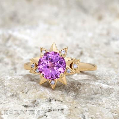
This enchanting 14K yellow gold engagement ring is a masterful celebration of celestial beauty and ...
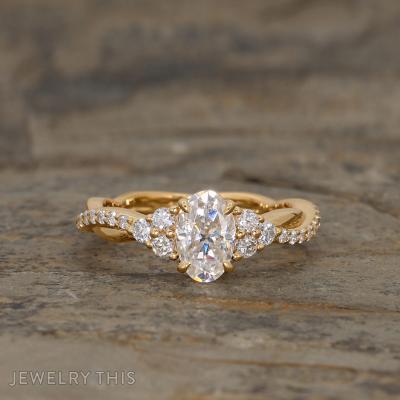
This exquisite engagement ring features a 1-carat oval moissanite center stone, beautifully complemented by delicate ...

This custom ring is a meticulous recreation of a cherished heirloom piece with stunning vintage ...

This Oval Hidden Halo Engagement Ring stands as a timeless yet personalized masterpiece. Crafted in ...
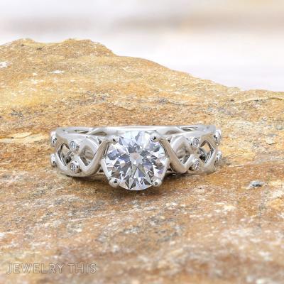
This platinum engagement ring showcases a round diamond at its center, held securely by four ...
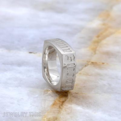
This custom silver ring showcases a bold, square design with beautifully engraved Old English script ...

Crafted with intricate detail and symbolic meaning, this wedding band is a testament to everlasting ...

This 14karat White gold ring is a beautiful tribute to the matriarch of a beloved ...

Crafted to restore a lost family treasure, this Yellow gold ring exudes elegance and sentimental ...

This exquisite Yellow gold ring features two oval Emerald stones, elegantly offset side by side ...