Every piece here started as a real conversation with a real client, with a reason behind it, a story, and a lot of emotion. We’re not showing you a catalog. We’re showing you what’s possible, so you can design your own.

Grandchildren’s Names Bracelet — Linked Initials in Gold
This bracelet centers a round engraved charm set into an oval-link chain, designed to display three names woven together through their shared letters — a visual way of showing that these three children are connected. The charm was engraved on both sides so the design remains visible no matter how the charm settles on the wrist. Cast in 10k yellow gold, the piece pairs a sentimental, personalized centerpiece with a sturdy everyday chain suited to daily wear. The design went through two rounds of review — a rectangular version was considered before the client settled on the round shape as the better fit. This piece suits someone looking for a family-representation gift that reads as elegant script rather than a literal list of names, and that holds up to being worn regularly rather than saved for special occasions.
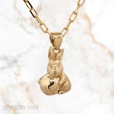


3D Gold Bunny and Pea Pendant — Kids’ Nicknames Necklace
This pendant began as a father’s idea to capture both of his children in a single wearable piece — a baby bunny nuzzling a small, uneven pea, cast entirely in 14k yellow gold and sculpted in the round rather than as a flat relief. The bunny represents a son once nicknamed “Bunny,” and the pea represents a daughter once called “Little Pea,” with the pea intentionally left slightly irregular rather than a perfect sphere. Because the piece is fully three-dimensional front and back, it was cast in multiple parts and assembled by hand, giving it the tactile, in-the-round quality of a small figurine rather than a typical flat pendant. It hangs from an 18-inch diamond-cut cable chain and suits anyone drawn to sculptural, dimensional jewelry with a personal story behind every detail, rather than a purely decorative piece.
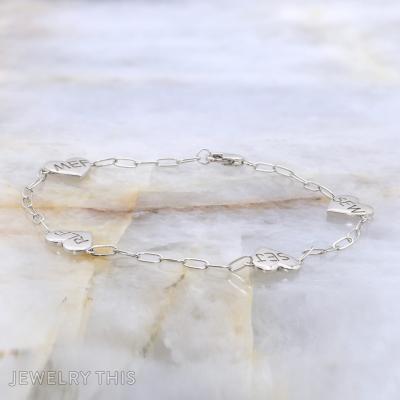
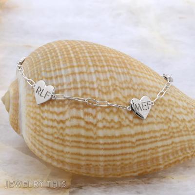
Heart-Link Charm Bracelet in 14k White Gold with Engraved Initials
This bracelet pairs a visible paperclip-style chain with four small heart-shaped links, each hand-engraved with a set of initials in a script font. The hearts are built into the chain itself rather than hanging as separate charms, so the initials sit flush along the bracelet as you wear it. Designed as one of two matching pieces for a mother-daughter set, the hearts are spaced evenly around the band and the chain was sized to fit comfortably with a bit of slack over the wearer’s measured wrist size. It suits someone who wants a piece that reads as meaningful rather than decorative, and who wears bracelets daily rather than saving them for special occasions.


Circle Pendant With Three Children’s Names in Rose Gold
This circle pendant was designed to hold three children’s names in one continuous, unbroken shape. Each name is hand-inscribed in a delicate script font around the ring, with the three names separated by pave-set lab diamond bands rather than a single line of stones. The pendant is solid rather than hollowed out, giving it consistent weight and preventing any visibility of an open interior from certain angles. It hangs from a fine diamond-style chain, and the chain attachment points were widened slightly from the first design to sit more naturally against the pendant. At just 0.7 inches across, the piece stays compact and wearable every day while keeping all three names legible. It suits anyone who wants a family piece that reads as one unified circle rather than three separate elements strung together.


Pumpkin Initial Ring — Two Kids’ Initials in Silver Vine Band
This ring centers on two dimensional pumpkins cast into a scrolling vine band, each pumpkin carrying a small enameled initial in violet. The vine motif was refined through several rounds of design review to land on a smooth, softly rounded pumpkin shape rather than a heavily grooved one, and the open filigree scrollwork on the band echoes the curling vine theme without adding bulk. Made in 14k white gold, the piece was designed for nickel-sensitive skin and for daily wear. It suits someone who wants a personal, nature-inspired ring with a playful seasonal motif that still reads as fine jewelry rather than costume novelty.


Custom Monogram Pendant — Two Enamel Initials in Gold
This square pendant is cast in 10k yellow gold with a white enamel background framed by a raised gold border. Two large letterforms sit side by side, one filled in teal enamel and the other in navy, with a script name line running beneath them in raised gold. The back is polished smooth and engraved with a meaningful date and a short numeric line, centered at the bottom. The design went through several rounds of refinement to get the raised gold outlines, enamel colors, and lettering font exactly right, and it hangs on a fine gold cable chain suited for everyday wear.


Otto Name Ring — Cut-Out Letters in 14k Yellow Gold
This band is built entirely from negative space — the letters O-T-T-O are cut directly through a solid yellow gold band rather than applied on top of it, so the name reads as an open silhouette rather than a raised inscription. The two T’s were specifically designed to share vertical lines with the band structure, creating a seamless, illusion-like transition rather than four separate applied letters. The O’s were refined during the design phase from a rounder shape into a more oval form after the client felt the initial circles looked dropped-in rather than integrated. The piece went through several rounds of sketch revisions — including a version with seven gemstones lined across the top, one for each embryo in the couple’s path to their son — before the client ultimately decided to keep the band stone-free for a cleaner look. The finished ring is a substantial 5-6mm width in polished 14k yellow gold, sized for the wearer’s hand.