
Two-Tone Gold Name Pendant with Diamond Accent
$$$
10k yellow gold, 10k white gold, lab diamonds
A client came to us wanting to honor her husband ahead of their wedding anniversary, working from a sketch she drew herself on a sticky note — his name written vertically, the word FOREVER written horizontally, sharing one letter between them. Over several rounds of feedback she refined the font to a softer, more rounded style and added a twisted rope border around the edges for a more feminine finish. It arrived the day before their anniversary, and she wrote: 'It's beautiful and arrived a day before our anniversary. I get a ton of compliments on it.'
'I LOVE LOVE LOVE it!! Full speed ahead' — on seeing the first photorealistic render
'It's beautiful and arrived a day before our anniversary. I get a ton of compliments on it. Really pleased with the whole experience.' — on delivery
Quick specs
Design type
Primary Metal
Secondary Metal
Shape / Cut
Primary Stone
Accent Stones
Design Complexity
Intent: Certainty
Size
Pendant approximately 1.5in (38mm) rectangular plaque. Rope-style border edging.
How they made it distinctive
-
01
Two words sharing a single letter across a vertical name and a horizontal FOREVER — a layout planned specifically during the sketch phase
-
02
Two-tone gold construction: yellow gold plaque with white gold raised lettering for contrast and legibility
-
03
Rope-style twisted border added at the client's request for a softer, more feminine frame around the lettering
-
04
Font changed from a blocky style to a rounded one after client feedback on the first sketch
-
05
Small diamond cluster set into the shared letter as a subtle focal accent rather than a large center stone
How you'd make it yours
Metal: this piece is 10k yellow and white gold two-tone — the same layout works in 14k or 18k, or a single metal color throughout
Border: this piece uses a rope twist edge — a new commission could use milgrain, a plain polished edge, or another decorative border
Stone: this piece uses a small lab diamond cluster — a new commission could use natural diamonds, a birthstone, or omit the stone accent entirely
Size: made to fit this design's specific letter layout — a new commission is sized to its own wording and wearer preference
Layout: the shared-letter technique used here works with other word or name pairings on a new commission
One of a kind: this exact pendant was designed for one client and is not reproduced — a new commission is an original piece inspired by this one, not a copy
Design changes made
The lettering font was changed from a blocky style to a more rounded, cursive-leaning style after the first sketch, and a twisted rope border was added around the plaque edges at the client's request for a softer, more feminine finish.
Who this is for
This piece is for someone who wants a keepsake that carries a name and a feeling in the same small space, without it reading as a plain nameplate. It's especially right if you have a simple, personal idea sketched out yourself and want to see it built with real detail and dimension rather than a flat engraving.
How it's made
Once the sketch and font were approved, the design moved into a 3D CAD model, which was reviewed as a photorealistic render before any metal was committed. A resin model was then 3D printed as a physical preview of the piece prior to casting. From that model, the pendant was cast in 10k yellow gold for the plaque and border, with the raised lettering cast separately in 10k white gold for contrast.
After casting, the yellow gold plaque and rope border were polished to a bright finish, while the white gold letters were finished to stand out clearly against the yellow background. The shared letter connecting the two words was then set by hand with a small cluster of round lab-created diamonds, and the bail was fitted and stamped with its metal purity mark before the piece was strung on a gold rope chain.
Key note
The name and the word FOREVER were cast in two different gold colors specifically so the raised lettering would stand out clearly against the polished background rather than blending into it.
Pricing guidance
A two-tone gold nameplate pendant with a decorative border and a small diamond accent sits toward the higher end of the mid range for custom pendants of this size. Most of the cost comes from the metal weight of a solid 1.5-inch plaque plus the labor of casting raised two-tone lettering and hand-finishing a textured border. Diamond count and metal karat are what move the price most from there.
Moves price up ↑
- ↑ Increasing the plaque size beyond 1.5 inches, which adds significant metal weight
- ↑ Upgrading from 10k to 14k or 18k gold
- ↑ Adding diamonds along the full border instead of a single accent cluster
- ↑ Choosing natural diamonds instead of lab-created diamonds
- ↑ Engraving a second design element on the reverse side
Moves price down ↓
- ↓ Reducing the plaque to a smaller size to use less metal
- ↓ Removing the diamond accent from the shared letter entirely
- ↓ Simplifying the border to a plain polished edge instead of a rope texture
- ↓ Using a single metal color throughout instead of two-tone construction
- ↓ Choosing a lighter-weight chain instead of a substantial rope chain
Questions people ask
Yes. This style is achieved by casting the background plaque in one gold color and the raised lettering in a contrasting color, then joining them so the letters sit slightly above the surface. The contrast makes the text easy to read at a glance rather than blending into the metal. It requires an extra casting and finishing step compared to a single-color pendant, but the result holds up well over time since the color comes from the gold itself, not a coating.
Lab-created and natural diamonds are chemically and visually identical — the same hardness, brilliance, and clarity grading apply to both. For a small accent cluster like the one used here, the practical difference is sourcing cost, since lab-created stones are generally less costly to produce at the same clarity grade. Many clients choose lab-created diamonds for exactly this reason when the diamonds are accents rather than a center stone. Either option will hold up equally well to daily wear.
A cast pendant with raised lettering is quite durable for daily wear because the letters are solid gold, not applied or glued on top of the surface. The main area to watch is the border detailing, which can pick up minor wear over years of contact with clothing, similar to any textured metal surface. Keeping the piece stored separately from other jewelry when not worn helps the rope border keep its crisp detail longer. Occasional professional polishing can restore shine if the finish dulls over time.
A pendant of this size and complexity — a 1.5-inch two-tone gold plaque with a textured border and a small diamond accent — falls in the mid-to-upper range for custom pendant work. The main cost driver is the gold weight required for a plaque this size, plus the extra labor of casting two metal colors and hand-finishing a decorative border. Chain choice and diamond upgrades are added separately and shift the total from there.
The design phase for a pendant like this typically takes about one to two weeks, covering the initial sketch, font and border revisions, and the final photorealistic render for approval. Once the design is approved, production runs another three to four weeks, including casting, finishing, and diamond setting. Total turnaround from first sketch to shipping is typically five to six weeks depending on how many rounds of design feedback are needed.
Yes, the border on a plaque pendant like this can be changed to a variety of textures — a plain polished edge, a milgrain detail, or a different decorative pattern entirely. The rope twist was chosen here for a softer, more feminine look framing the lettering. Border style is one of the more flexible elements of this design since it doesn't affect the structural layout of the lettering underneath.
Yes, sharing a letter between two words is a layout technique that works well on a rectangular plaque pendant, since one word can run vertically and the other horizontally, crossing at the shared letter. It takes some sketch revision to get the proportions and spacing right, but it's a design approach that reads clearly once finalized. This layout was specifically planned during the sketch phase before the piece moved to a 3D model.
Explore Similar Creations
Every masterpiece starts with a spark. Explore how our clients raw ideas - sketches, heirlooms, inspirations - were transformed into bespoke works of arts.
Crafted with exquisite detail, this custom pendant boasts an interlocking design that seamlessly combines elements ...

This dainty 14k yellow gold mini star pendant is captivating with its intricate details. The ...

This sterling silver pendant was created as a tribute to the client’s company. The pendant ...

17mm round pendant with a cut out cat silhouette and detailed engraving on the back. ...

This exquisite yellow gold pendant is a testament to elegance and sophistication. Hanging from a ...

Crafted in radiant 10K yellow gold, this pendant features cursive script that spells out “Ling ...

This minimalist gold pendant is a simple yet elegant design, featuring the word ‘Just’ in ...

This pendant takes the form of a bird in flight, wings fully outstretched and rendered ...

A logo pendant made in sterling silver with gold plated details. The pendant is approximately ...
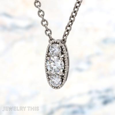
This oval pendant sets three round lab-grown diamonds vertically in a milgrain-beaded frame, with a ...

This pendant was designed to embrace the power of faith. This custom sterling silver cross ...

A stunning custom jewelry pendant inspired by a passion for music. Expertly crafted from highly ...