
Interlocking Initials Pendant in 14k Yellow Gold
$$
14k yellow gold
A client set out to honor the three people closest to him — his girlfriend and his two daughters — by combining their initials into a single wearable design. He pushed back more than once when early drafts felt too delicate, asking for something more angular and masculine, and the design shifted from a cut-out pendant to a solid rectangular plaque with raised lettering along the way. The result is a piece built specifically to carry those three initials in a form he was comfortable wearing every day.
Quick specs
Design type
Primary Metal
Primary Stone
Accent Stones
Design Complexity
Intent: Certainty
Size
Pendant 25mm x 19mm (1in x 0.75in). Approximate finished weight 8-9 grams.
How they made it distinctive
-
01
Rectangular solid plaque chosen over the original cut-out concept specifically so the design could read as more substantial and masculine
-
02
Letterforms deliberately made more angular rather than curved, per the client's direct feedback after an early draft felt too soft
-
03
Two-finish treatment — matte recessed background with a polished raised letterform and frame — chosen to make the initials stand out clearly
-
04
Three initials combined into one interlocking mark representing the client's girlfriend and his two daughters
-
05
Bail finished specifically to accept the client's own existing gold chain rather than a new one
How you'd make it yours
Background: this piece uses a solid matte-finished plaque; a new commission could use an open cut-out background for a lighter, more airy look
Metal: this piece is 14k yellow gold; the same letterform language works in 18k yellow gold, white gold, or rose gold
Letterform count: this piece interlocks three initials; a new commission could use two, four, or a single monogram letter
Finish contrast: this piece pairs a matte background with polished raised letters; the finishes could be reversed or made uniform on a new piece
Engraving: the smooth reverse of a solid-background plaque can carry a date or short phrase on a new commission
One of a kind: this exact pendant was designed around one client's specific set of initials and is not reproduced — a new commission is an original piece inspired by this one, not a copy
Design changes made
The design moved from an open cut-out pendant to a solid rectangular plaque with raised letters after the client felt the original cut-out version read as too feminine; the letterforms were also made more angular per his request, and the background finish was changed to a matte recessed surface with a polished frame to make the raised initials stand out.
Who this is for
This piece is for someone who wants to carry the people closest to them without wearing something that feels delicate or decorative for its own sake. It's especially right for someone who knows exactly what they don't want — too soft, too ornate — and is willing to go through a few rounds of revision to get a bold, personal design that feels like them.
How it's made
Once the final design was approved, the piece was built as a 3D digital model and then 3D-printed in resin to create a wax-equivalent pattern — the client was shown a photo of this resin stage before casting. The resin pattern was attached to a wax tree, invested in plaster, and burned out in a kiln to leave a hollow mold, into which molten 14k yellow gold was cast under heat before the piece was extracted from the mold for finishing.
After casting, the pendant was cleaned up and the two contrasting finish zones were applied: the recessed background was given a matte finish while the raised letters and the outer frame were polished to a bright, reflective contrast. The bail was finished to accept the client's existing gold chain, and the piece was given a final polish and quality check before shipping.
Key note
The pendant was switched from an open cut-out design to a solid-background plaque partway through production planning, which increased the metal weight and required re-costing the piece before casting.
Pricing guidance
A solid rectangular initial pendant in 14k yellow gold with raised custom lettering sits in the mid range for personalized pendants of this size. Most of the cost comes from the custom 3D modeling required to balance multiple letterforms into one cohesive design, plus the gold weight of a solid (non-cut-out) plaque. Finishing — the matte-and-polish contrast — adds a modest amount on top of the base casting cost.
Moves price up ↑
- ↑ Switching from a cut-out design to a solid-background plaque, which increases gold weight
- ↑ Upgrading from 14k to 18k yellow gold
- ↑ Adding more initials or a more complex interlocking letterform arrangement
- ↑ Adding stone accents or an engraved reverse side
- ↑ Increasing the pendant size beyond one inch
Moves price down ↓
- ↓ Returning to an open cut-out design, which reduces gold weight and cost
- ↓ Using a smaller pendant size
- ↓ Choosing gold-plated silver instead of solid 14k gold
- ↓ Simplifying the letterform to fewer initials
- ↓ Skipping the matte finish in favor of a single uniform polish
Questions people ask
Yes, combining two or three initials into a single interlocking letterform is a common custom pendant request. The letters are typically designed to share a frame or background so they read as one cohesive mark rather than separate characters. Getting the balance right usually takes a few rounds of sketch review, since each letter's proportions affect how the others look next to it. A designer can adjust angularity, spacing, and which letters sit in front to get a result that reads clearly.
A cut-out pendant has the letterform or design fully open, so light passes through the negative space and the piece is lighter in metal weight. A solid-background pendant keeps a flat plaque behind the raised design, which uses more metal and therefore weighs more and costs somewhat more to produce. Solid-background designs also allow for a two-tone finish, like a matte background with a polished raised element, which isn't possible on an open cut-out piece. The choice is mostly aesthetic and a matter of how much contrast and weight you want in the final piece.
A personalized initial pendant in solid 14k yellow gold, around one inch in size, typically falls in the mid range for custom pendant work. The main cost drivers are the 3D design work needed to balance multiple letterforms and the gold weight of the final piece. Choosing a cut-out design, a smaller size, or gold-plated silver instead of solid gold would bring the cost down; upgrading the karat or adding stones would raise it.
This particular pendant, at about one inch by three-quarters of an inch in solid 14k yellow gold, weighs approximately 8 to 9 grams after polishing and finishing. Weight will vary based on size, whether the design is cut-out or solid-background, and the metal chosen. A cut-out version of the same design would weigh noticeably less since there's less metal overall.
Yes, a two-finish approach is a common way to make raised lettering stand out from its background. A typical combination is a matte or brushed finish on the recessed background with the raised letters and outer frame polished to a bright shine, which creates strong visual contrast. This only works on a solid-background design, since a cut-out piece has no background surface to finish differently. The contrast can also be reversed, with a matte letter against a polished background, depending on preference.
Yes, 14k gold is a common and durable choice for daily-wear pendants because it has enough alloy content to resist bending and scratching better than higher-karat gold like 18k or 24k. A pendant with a mix of polished and matte surfaces will show wear differently over time — the polished areas may pick up fine scratches with daily wear, while the matte surface tends to hide small marks better. Regular cleaning with a soft cloth helps maintain the contrast between the two finishes. 14k gold does not tarnish or require re-plating, unlike gold-plated alternatives.
Yes, a pendant like this is typically designed with a bail sized to fit a standard chain, and in this case the piece was specifically finished to go on the client's own existing gold chain rather than a new one supplied with the pendant. It's worth confirming the bail opening width against your chain's thickness before finalizing the design, especially if you use a thicker chain style. A bail can be sized larger during design if a wider chain is planned. This keeps the cost focused on the pendant itself rather than including a new chain.
Yes, engraving is a common alternative or addition to a raised-letter front design. A pendant like this could carry a date, a short phrase, or additional initials engraved on the smooth reverse side of the plaque, since the back of a solid-background pendant is typically left flat and available for this. This would be a separate design decision from the raised front lettering and does not affect the front's finish or weight significantly. It's a common way to add a private detail without changing the piece's public-facing look.
Explore Similar Creations
Every masterpiece starts with a spark. Explore how our clients raw ideas - sketches, heirlooms, inspirations - were transformed into bespoke works of arts.
Discover the power of expression. This exquisite silver pendant, designed to embody the essence of ...

This sterling silver pendant takes the form of a four-petal flower, each petal holding a ...

This oval pendant reproduces a classic Our Lady of Fatima medallion, showing the Virgin above ...

A showcase of passion and pride this Silver Logo Pendant is a striking symbol of ...

This custom pendant features a beautifully crafted cut-out heart outline, symbolizing love and connection. In ...
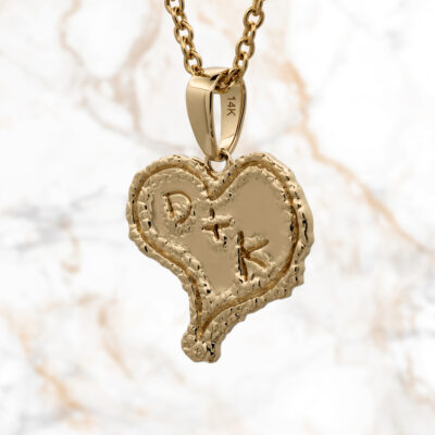

A unique family crest pendant created in 14k white and yellow gold with enamel details ...

This custom pendant is a beautifully crafted sterling silver key design, making it a symbol ...
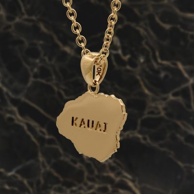
10k yellow gold pendant cutout in shape of Kauai Island. Personal engraving on back. Pendant: ...

A passion immortalized in precious metal, this pendant reflects the client’s dedication to their craft. ...

Elegance takes flight with this custom origami bird pendant. Meticulously crafted in white gold, the ...

This cluster pendant was designed around a lab-created pink sapphire at the center, paired with ...